Describing Bar Charts and Column Charts (1)
Bar charts and column charts are similar: only their orientations differ. A bar chart is orientated horizontally, whereas a column chart is arranged vertically. Sometimes “bar chart” refers to both forms.
These types of charts are usually used for comparison purposes (unlike line charts, which describe change).
Observe the following chart :
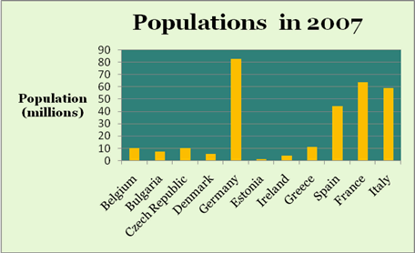
It shows the populations of various European countries in the year 2007. The populations are only for one year, 2007, and so we cannot make any comments about change in population: we can only compare one county with another.
When you write about a bar or column chart it is important to look first at the Chart Title. This tells you what information the chart displays and you can use this information in your description.
Then look at the X and Y axes. The titles of these axes sometimes give you information you can use in your description. It is important also to look at the UNITS. On the Y-axis in this chart the units are millions. The population of Belgium in 2007 was not 10, but 10 million people.
Bar and column charts show similarities and differences. When describing these charts you need to make comparisons.
You also need to group together any columns which have broad similarities.
To write a short description of this graph ask yourself (and answer!) the following questions:
- What exactly does the chart show? (Use the chart title to help you answer this question)
- What are the axes and what are the units?
- What similarities are there?
- Is it possible to put some of the columns into one or more groups?
- What differences are there?
Answering these questions will help you to write a short description of this simple column chart.
Here is an example:
This chart shows the populations of some European countries in 2007. The country with the largest population is Germany, with over 80 million people whereas Estonia has the smallest population, at little more than a million. Belgium, Bulgaria, the Czech Republic, Denmark, Estonia and Ireland all have populations or ten million or less, while Greece has a population of about eleven million. Apart from Germany, the largest countries are Spain, France and Italy with populations ranging from about forty-four to sixty-three million. Together, the four largest countries account for over eighty per cent of the population of the countries shown.
Vocabulary
To make comparisons, you need to know the comparatives and superlatives of common adjectives. Here are some examples:
Adjective Comparative Superlative
bad worse worst
big bigger biggest
expensive more expensive most expensive
good better best
great greater greatest
high higher highest
large larger largest
little less least
long longer longest
low lower lowest
many more most
much more most
new newer newest
old older oldest
poor poorer poorest
rich richer richest
short shorter shortest
small small smallest
strong stronger strongest
weak weaker
To signal comparison and contrast within a sentence you can use the following conjunctions:
as ……. as, not as ……… as, not so …….. as, whereas, but, while, although
To signal comparison and contrast between sentences you can use the following words and phrases:
Describing Bar Charts and Column Charts (2)
Bar charts and column charts are often used to make multiple comparisons.
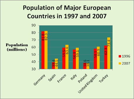
It shows the populations of major European countries in the years 1996 and 2007. In this case we can make two sets of comparisons. We can look at the change in population from 1996 to 2007 for each country, and we can compare the populations of the various countries in each year.
Look at the Y axis. You can see that it starts at 30, not zero. Sometimes charts are formatted like this in order to make the differences more obvious. To see a comparison, see the next page.
In general, when describing a chart of this type, you should describe the most important change first. Then you can compare individual items (in this case, countries).
The most important information on this chart is that in all countries, except Poland, the population increased from 1996 to 2007.
Now you can compare individual countries and you can compare two things: You can compare sizes of populations and you can compare the change in populations from 1996 to 2007. We’ll concentrate on the change in population.
You can compare the largest change and the smallest change: The largest change was in Turkey, where the population rose from about 62 to about 73 million, whereas the smallest increase was in Germany where the population of nearly 82 million rose by half a million. Spain also had a fairly large increase from 39.4 million to 44.5 million.
It is important to mention any exceptions to the changes you describe. In this case, the exception is Poland where the population fell very slightly in the period described.
To write a short description of this graph ask yourself (and answer!) the following questions:
- What exactly does the chart show? (Use the chart title to help you answer this question)
- What are the axes and what are the units?
- What changes are there?
- What similarities are there?
- Is it possible to put some of the columns into one or more groups?
- What exceptions are there?
Answering these questions will help you to write a short description of this simple column chart. For example:
This chart shows the populations of major European countries in 1996 and 2007. In all countries except Poland the population rose in this period. The largest rise was in Turkey where the population increased from over 62 to over 73 million, whereas the smallest increase was in Germany where the population of 82 million rose by a few thousand. Spain also had a fairly large increase from 39.4 million to 44.5 million, and France was not far behind with an increase of almost 4 million. In the other two countries, Italy and the United Kingdom, population growth was more modest with increases of about 2.3 and 2.8 million respectively. In Poland, the population fell by half a million. Poland had the smallest population in both 1996 and 2007. Although Spain and Portugal had comparable populations in 1996, Spain’s population is now nearly six and a half million greater than Poland’s.
Vocabulary
Describing Bar Charts and Column Charts (3)
It is important to look at the axes of graphs and charts
Observe the following charts:
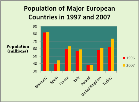
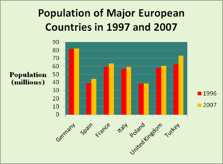
These two charts show EXACTLY the same information. However, it is easier to see the differences in the first chart because the Y axis starts at 30, not zero. Sometimes charts are formatted like this in order to make the differences more obvious.
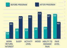
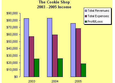
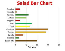
Bar Chart Graphics Exercise
The students will describe the graphic assigned to that student to the other students.
Describe a Bar Chart Worksheet
WereVerse Universe Baby!









I need to know how to use ‘highest amount of students’ in describing a pie or bar chart. Is it singular or plural.
“the students” is plural