Scatterplots are used to display the relationship between two quantitative variables.
One variable on horizontal axis, one on vertical. Measure both
variables on each individual. Each individual appears as one point in the plot. Can use different symbols (tags) to show the effect of a categorical variable. If there is an explanatory variable, always put the explanatory variable on the horizontal axis.
Example Manatees are a large, gentle sea creature living along the Florida coast. Many manatees are killed or injured by powerboats.
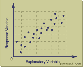
Explanatory Variable =
Response Variable =
Scatterplot: How describe the relationship?
Interpreting Scatterplots:
1) Look for overall pattern
direction form strength
2) Look for deviations from overall pattern
Outliers – any individual observation that falls outside the overall pattern of the graph.
Direction:
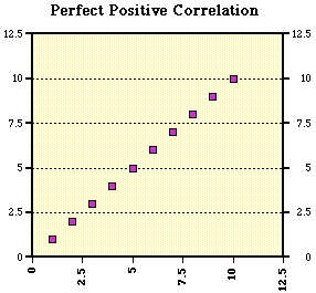
Positive Association: Two variables are positively associated when high values on first variable occur with high values on second variable, and low values occur with low values.
e.g. Students with higher SAT scores tend to have higher frosh GPAs
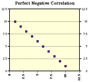
Negative Association: Two variables are negatively associated when high values of one variable occur with low values of the other, and vice versa.
e.g. People who smoke tend to have shorter life spans.
Overall Pattern: To describe a scatterplot, state the direction (positive or negative), form (is it linear?), how strong the relationship appears (how large is the scatter), and identify any outliers.
Problems with Scatterplots
– Changes in scale can drastically effect the picture presented.
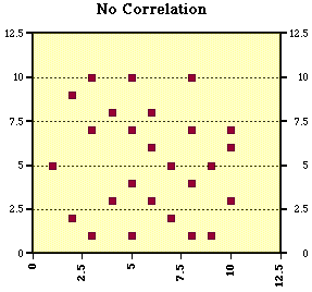
Describe the following Scatterplots:
Describe a Scatter Plot Worksheet
WereVerse Universe Baby!


